I have been interested in color effects for awhile. The next film will have some interesting use of color. Not sure just what yet, but something to make the visual component more compelling and aid in communicating the mood of the story. Towards that end, I’ve been playing with Nudged to see if I can find a color pallet I like.
Nudged in it’s original release form has fairly bright and balanced colors with skin tones that are full and rich. See the photo below. The film, Mr. Turner, is based on the life of the painter, Joseph Mallord William Turner, and the filmmakers used the colors of his paintings for the palette of the film. I used an idea from Mr. Turner for color balancing in Nudged. Turner (the painter) used warm yellow in his highlights and a blue teal in the shadows. These were Turner’s two complementary colors. I used these two colors with my color grading software to adjust the color in many scenes.

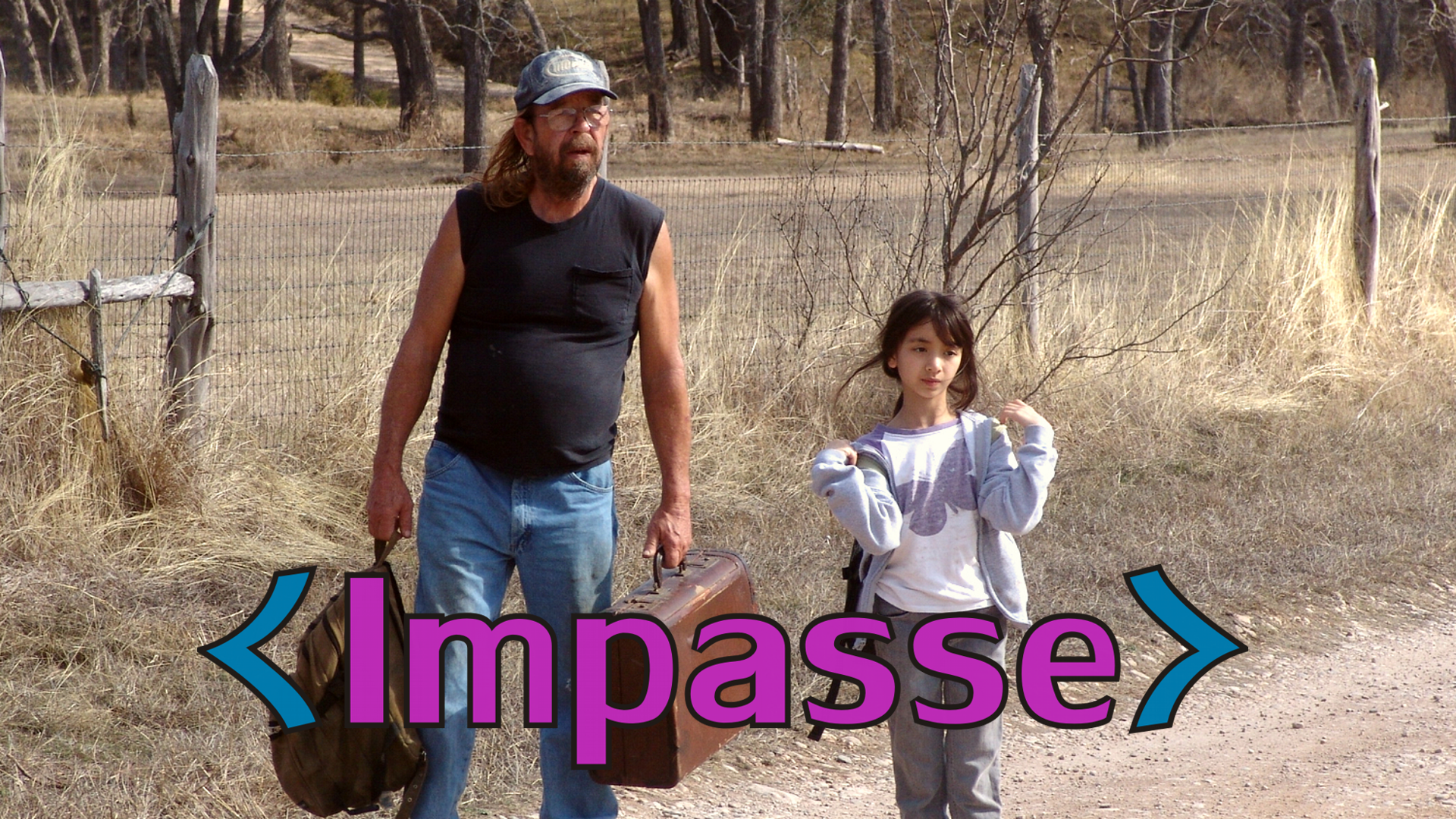
Nudged as originally released in May 2015
One film that has attracted me for it’s use of color has been The Illusionist. For The Illusionist they sought to imitate an early color process called Autochrome. The Autochrome photographic process created pictures that had a limited color palette with increased dark areas and a sort of warm sepia tint. This process lacks the ability to capture reds and saturated blues, but it produces nice shades of pink and violet, as well as prominent orange and pale cyan colors. Images are also pixelated due to the nature of the process resulting in a soft focus effect. I did not want to make the images in Nudged fuzzy but I did try an experiment to tint Nudged to sort of match The Illusionist. The result of this is below.

Attempt to simulate the Autochrome color process
The above image has a slight pink/orange cast to it. That’s about all I could do to approximate an Autochrome image. Attempts to produce deeper blacks and match the coloration of an Autochrome image just never worked out.
The final experiment was to simulate the “bleach bypass” used when developing film. This process, with film, results in deeper blacks, muted colors and over exposed skies. One can simulate this process by making a B&W copy of the color digital file and then laying that B&W copy on top of the color original. By varying the transparency of the B&W copy, the degree of color can be varied. I used about 30% transparency and achieved an effect that has less intense colors and a slight push towards blue.

Nudged with simulated Bleach Bypass process

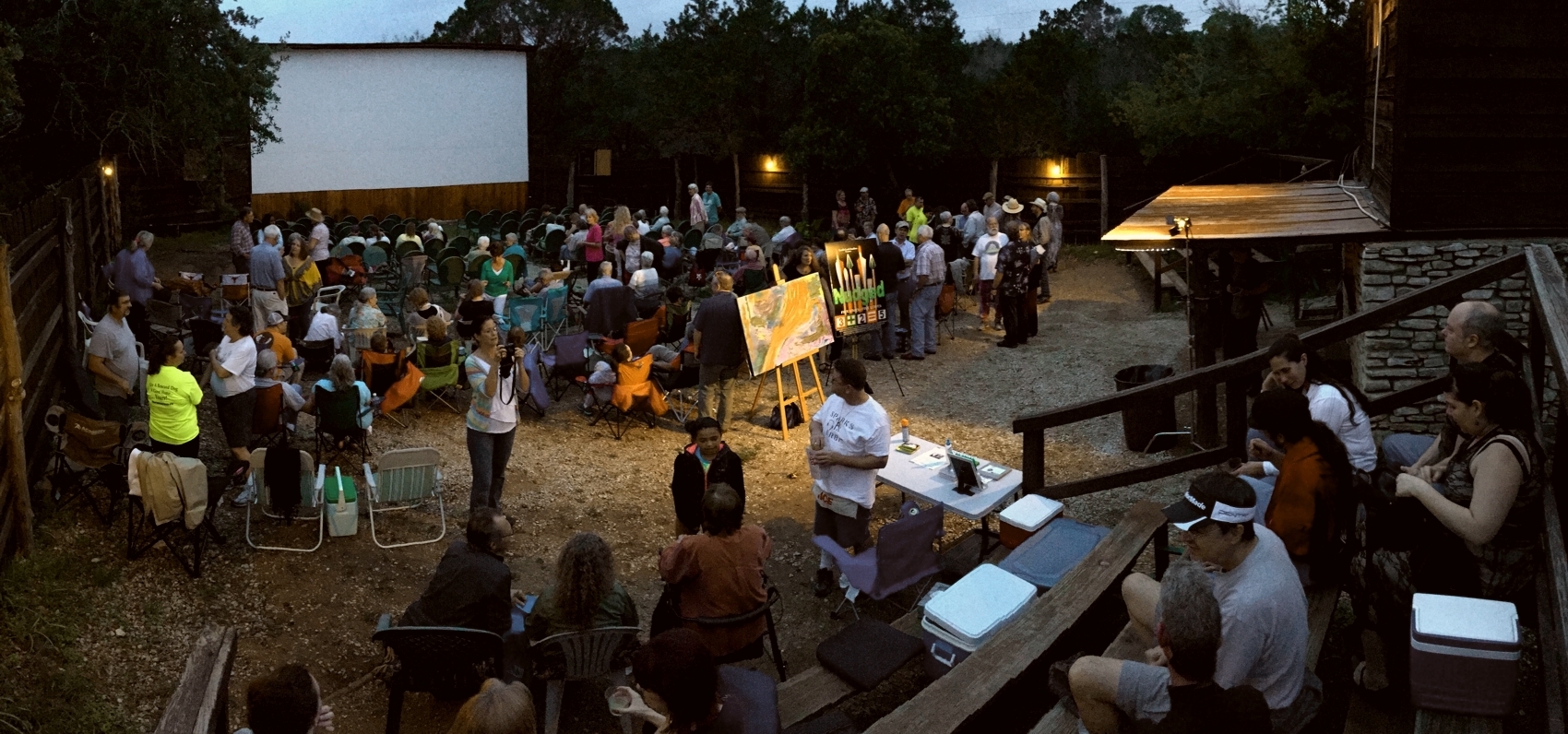


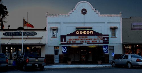


 Nudged is scheduled to be shown at the Odeon Theater in Mason, Texas on Wednesday, October 14th, 7 pm. There will be a Q&A with the director after the film.
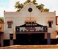

 If you look closely at the photo on the right, you will see some shiny places. That is the light reflecting off the cellophane shrink-wrap. This is the proof copy of the commercially-produced DVD of Nudged.
